Reanimated Drawer Layout
Cross-platform replacement for the React Native's DrawerLayoutAndroid component.
For detailed usage of standard parameters, please refer to the React Native docs.
Usage:
To use it, import it in the following way:
import ReanimatedDrawerLayout from 'react-native-gesture-handler/ReanimatedDrawerLayout';
Properties:
drawerType
specifies the way the drawer will be displayed.
Accepts values of the DrawerPosition enum. Defaults to FRONT.
FRONTthe drawer will be displayed above the content view.BACKthe drawer will be displayed below the content view, revealed by sliding away the content view.SLIDEthe drawer will appear attached to the content view, opening it slides both the drawer and the content view.
FRONT | BACK | SLIDE |
|---|---|---|
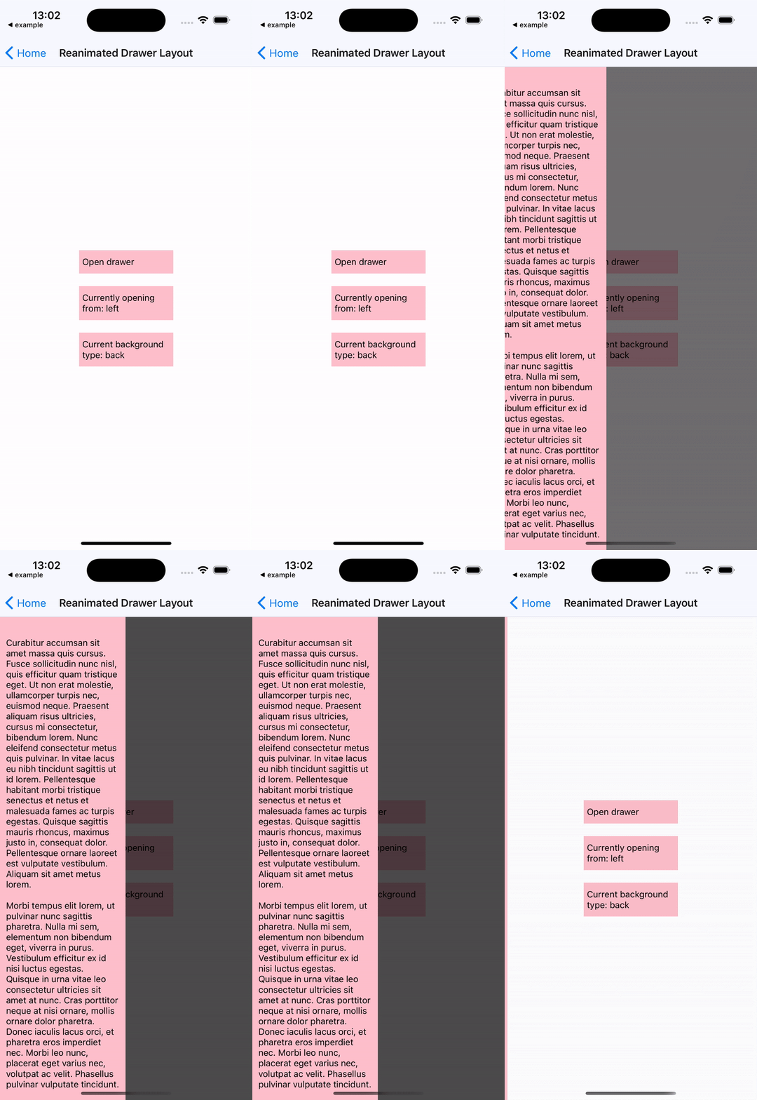 | 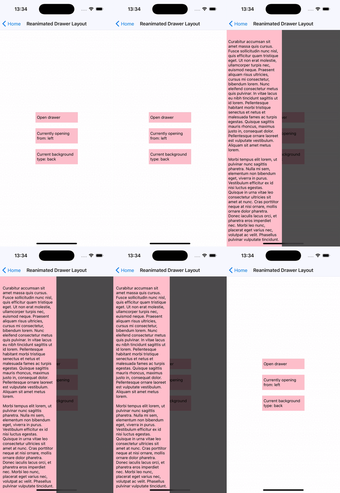 | 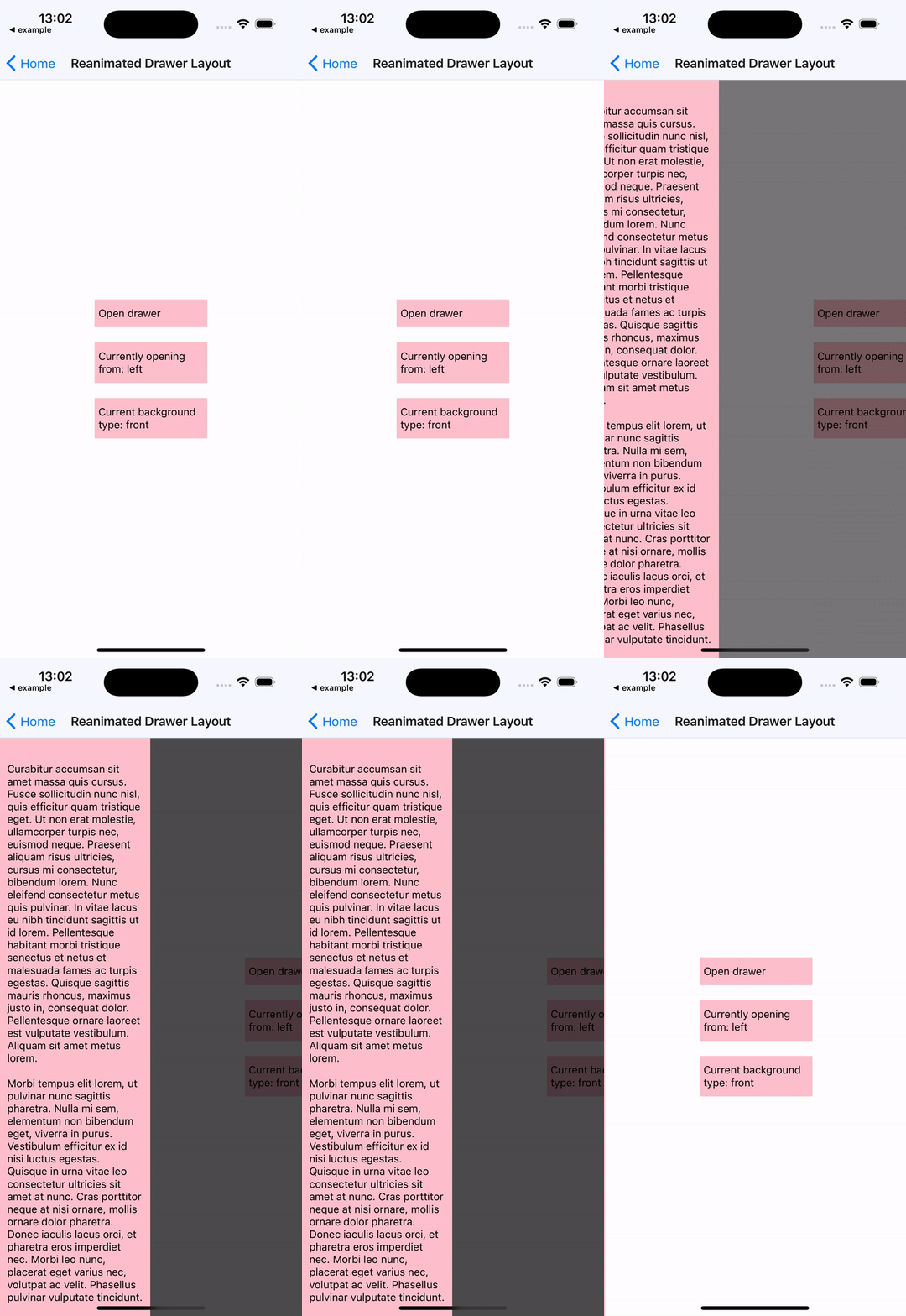 |
edgeWidth
width of the invisible, draggable area on the edge of the content view, which can be dragged to open the drawer.
hideStatusBar
a boolean value. When set to true, drawer component will use StatusBar API to hide the OS status bar when the drawer is dragged or idle in the open position.
statusBarAnimation
a string with possible values: slide, none or fade. Defaults to slide.
May be used in combination with hideStatusBar to select the animation used for hiding the status bar.
See StatusBar API docs.
overlayColor
color of the background overlay on top of the content window when the drawer is open.
This color's opacity animates from 0% to 100% as the drawer transitions from closed to open. Defaults to rgba(0, 0, 0, 0.7).
renderNavigationView
a renderer function for the drawer component, provided with a progress parameter.
progress-SharedValuethat indicates the progress of drawer opening/closing animation.- equals
0when thedraweris closed and1when thedraweris opened - can be used by the
drawercomponent to animated its children while thedraweris opening or closing
- equals
onDrawerClose
a function which is called when the drawer has been closed.
onDrawerOpen
a function which is called when the drawer has been opened.
onDrawerSlide
a function which is called when drawer is moving or animating, provided with a progress parameter.
progress-SharedValuethat indicates the progress of drawer opening/closing animation.- equals
0when thedraweris closed and1when thedraweris opened - can be used by the
drawercomponent to animated its children while thedraweris opening or closing
- equals
onDrawerStateChanged
a function which is called when the status of the drawer changes. It takes two arguments:
newState- interaction state of the drawer. It can be one of the following:DrawerState.IDLEDrawerState.DRAGGINGDrawerState.SETTLING
drawerWillShow-truewhendrawerstarted animating toopenposition,falseotherwise.
enableTrackpadTwoFingerGesture (iOS only)
enables two-finger gestures on supported devices, for example iPads with trackpads.
If not enabled, the gesture will require click + drag, with enableTrackpadTwoFingerGesture swiping with two fingers will also trigger the gesture.
children
either a component that's rendered in the content view or a function.
If children is a function, it is provided with a progress parameter.
progress-SharedValuethat indicates the progress of drawer opening/closing animation.- equals
0when thedraweris closed and1when thedraweris opened - can be used by the
drawercomponent to animated its children while thedraweris opening or closing
- equals
mouseButton(value: MouseButton) (Web & Android only)
allows users to choose which mouse button should handler respond to.
The enum MouseButton consists of the following predefined fields:
LEFTRIGHTMIDDLEBUTTON_4BUTTON_5ALL
Arguments can be combined using | operator, e.g. mouseButton(MouseButton.LEFT | MouseButton.RIGHT). Defaults to MouseButton.LEFT.
enableContextMenu(value: boolean) (Web only)
specifies whether context menu should be enabled after clicking on underlying view with right mouse button. Defaults to false.
Methods
openDrawer(options)
openDrawer accepts an optional options parameter, which is an object with the following optional properties:
initialVelocity- the initial velocity of the object attached to the spring. Defaults to0.animationSpeed- controls speed of the animation. Defaults to1.
closeDrawer(options)
closeDrawer accepts an optional options parameter, which is an object with the following optional properties:
initialVelocity- initial velocity of the object attached to the spring. Defaults to0.animationSpeed- controls speed of the animation. Defaults to1.
Example:
See the reanimated drawer layout example from GestureHandler example app.
import React, { useRef } from 'react';
import { StyleSheet, Text, View } from 'react-native';
import { Gesture, GestureDetector } from 'react-native-gesture-handler';

import ReanimatedDrawerLayout, {
  DrawerType,
  DrawerPosition,
  DrawerLayoutMethods,
} from 'react-native-gesture-handler/ReanimatedDrawerLayout';

const DrawerPage = () => {
  return (
    <View style={styles.drawerContainer}>
      <Text>Lorem ipsum</Text>
    </View>
  );
};

export default function ReanimatedDrawerExample() {
  const drawerRef = useRef < DrawerLayoutMethods > null;
  const tapGesture = Gesture.Tap()
    .runOnJS(true)
    .onStart(() => drawerRef.current?.openDrawer());

  return (
    <ReanimatedDrawerLayout
      ref={drawerRef}
      renderNavigationView={() => <DrawerPage />}
      drawerPosition={DrawerPosition.LEFT}
      drawerType={DrawerType.FRONT}>
      <View style={styles.innerContainer}>
        <GestureDetector gesture={tapGesture}>
          <View style={styles.box}>
            <Text>Open drawer</Text>
          </View>
        </GestureDetector>
      </View>
    </ReanimatedDrawerLayout>
  );
}

const styles = StyleSheet.create({
  drawerContainer: {
    flex: 1,
    justifyContent: 'center',
    alignItems: 'center',
    backgroundColor: 'pink',
  },
  innerContainer: {
    flex: 1,
    backgroundColor: 'white',
    alignItems: 'center',
    justifyContent: 'center',
    gap: 20,
  },
  box: {
    padding: 20,
    backgroundColor: 'pink',
  },
});