Buttons

 danger
Button components described in this section are deprecated and will be removed in the future. Please use Touchable instead.
The Gesture Handler library offers native components that function as buttons, serving as alternatives to TouchableHighlight or TouchableOpacity from the core React Native framework. These buttons process touch recognition natively, which ensures a deterministic response. This capability significantly enhances performance; for example, it allows for immediate ripple effects on Android, unlike TouchableNativeFeedback, which requires a touch event roundtrip to JavaScript that can cause delays, especially noticeable on older devices. Additionally, these components handle default platform interactions natively, particularly in scrollable containers where interactions are smartly delayed to prevent unintended highlighting during a fling.
Gesture Handler library exposes components that render native touchable elements under the hood:
On top of that all the buttons are wrapped with Native gesture and therefore allow for all its properties to be applied to them.
RawButton
The most basic button component does not provide any feedback and lacks props such as onPress. It serves as a foundation for other button components and is ideal if you wish to implement your own custom interactions for when the button is pressed.
RawButton accepts all Native gesture props, accessibility props, along with the following additional properties:
exclusive
exclusive?: boolean;
Defines whether pressing this button prevents other buttons exported by Gesture Handler from being pressed. By default set to true.
rippleColor
rippleColor?: number | ColorValue | null;
Defines color of native ripple animation.
rippleRadius
rippleRadius?: number | null;
Defines radius of native ripple animation.
borderless
borderless?: boolean;
If set to false, ripple animation will render only within view bounds.
foreground
foreground?: boolean;
Defines whether the ripple animation should be drawn on the foreground of the view.
touchSoundDisabled
touchSoundDisabled?: boolean;
If set to true, the system will not play a sound when the button is pressed.
BaseButton
Can be used as a base class if you'd like to implement some custom interaction for when the button is pressed. It has all the props of RawButton and in addition to that it also provides the following props:
onPress
onPress?: (pointerInside: boolean) => void;
Triggered when the button gets pressed (analogous to onPress in TouchableHighlight from RN core).
onLongPress
onLongPress?: () => void;
Triggered when the button gets pressed for at least delayLongPress milliseconds.
onActiveStateChange
onActiveStateChange?: (active: boolean) => void;
Triggered when the button transitions between active and inactive states. It passes the current active state as a boolean variable to the method as the first parameter.
delayLongPress
delayLongPress?: number;
Defines the delay, in milliseconds, after which the onLongPress callback gets called. By default set to 600.
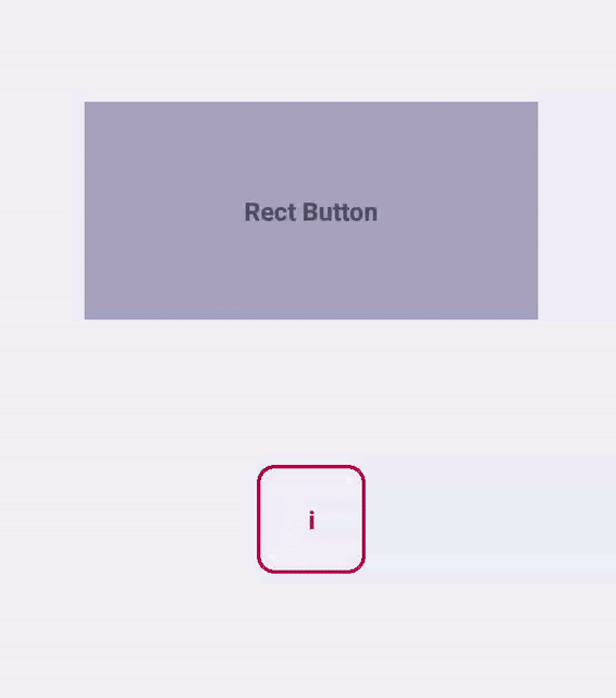
RectButton
This type of button component is ideal for use with rectangular elements or content blocks that can be pressed, such as table rows or buttons featuring text and icons. It ensures platform-specific interactions, such as rendering a rectangular ripple on Android or highlighting the background on iOS and older Android versions. In addition to the props offered by BaseButton, it accepts the following:
underlayColor
underlayColor?: string;
Background color that will be dimmed when the button is in an active state.
activeOpacity
activeOpacity?: number;
Opacity applied to the underlay when the button is in an active state.
BorderlessButton
This type of button component should be used with simple icon-only or text-only buttons. The interaction will be different depending on platform: on Android a borderless ripple will be rendered (it means that the ripple will animate into a circle that can span outside of the view bounds), whereas on iOS the button will be dimmed (similar to how TouchableOpacity works). In addition to the props of BaseButton, it accepts the following:
activeOpacity
activeOpacity?: number;
Opacity applied to the button when it is in an active state.
Accessibility
To guarantee that buttons are fully accessible, you must wrap your children in a View marked as accessible and include the accessibilityRole="button" prop. This requirement applies to both iOS and Android platforms. Without these adjustments, the button won't be selectable on iOS, and on Android, it won't be clickable in accessibility mode.
// Not accessible:
const NotAccessibleButton = () => (
  <RectButton onPress={this._onPress}>
    <Text>Foo</Text>
  </RectButton>
);

// Accessible:
const AccessibleButton = () => (
  <RectButton onPress={this._onPress}>
    <View accessible accessibilityRole="button">
      <Text>Bar</Text>
    </View>
  </RectButton>
);
Design patterns
Components listed here were not designed to behave and look in the same way on both platforms, but rather to be used for handling similar behaviour on iOS and Android taking into consideration their design concepts.
If you wish to get specific information about platforms design patterns, visit official Apple docs and Material.io guideline, which widely describe how to implement coherent design.
This library allows the use of native components with native feedback in adequate situations.
If you do not wish to implement a custom design approach, RectButton and BorderlessButton seem to be absolutely enough and there's no need to use anything else. In all the remaining cases, you can always rely on BaseButton which is a superclass for the other button classes and can be used as a generic React Native Touchable replacement that can be customized to your needs.
Below we list some of the common usecases for button components to be used along with the type of button that should be used according to the platform specific design guidelines.
Lists and action buttons
If you have a list with clickable items or have an action button that needs to display as a separate UI block (vs being inlined in a text) you should use RectButton. It changes opacity on click and additionally supports a ripple effect on Android.
To determine the emphasis of a button, it's vital to use a fill color or leave it transparent, especially on Android. For medium emphasis, you may consider outlined buttons which are used for lower impact than fill buttons.
Icon or text only buttons
Use BorderlessButton for simple icon-only or text-only buttons. The interaction will be different depending on platform: on Android a borderless ripple will be rendered, whereas on iOS the button will be dimmed.
It should be used if you wish to handle non-crucial actions and supportive behaviour.