Drawer Layout

 caution
This component is deprecated. Please use the reanimated version.
This is a cross-platform replacement for React Native's DrawerLayoutAndroid component. It provides a compatible API but allows for the component to be used on both Android and iOS. Please refer to React Native docs for the detailed usage for standard parameters.
Usage:
DrawerLayout component isn't exported by default from the react-native-gesture-handler package. To use it, import it in the following way:
import DrawerLayout from 'react-native-gesture-handler/DrawerLayout';
Properties:
On top of the standard list of parameters DrawerLayout has an additional set of attributes to customize its behavior. Please refer to the list below:
drawerType
possible values are: front, back or slide (default is front). It specifies the way the drawer will be displayed. When set to front the drawer will slide in and out along with the gesture and will display on top of the content view. When back is used the drawer displays behind the content view and can be revealed with gesture of pulling the content view to the side. Finally slide option makes the drawer appear like it is attached to the side of the content view; when you pull both content view and drawer will follow the gesture.
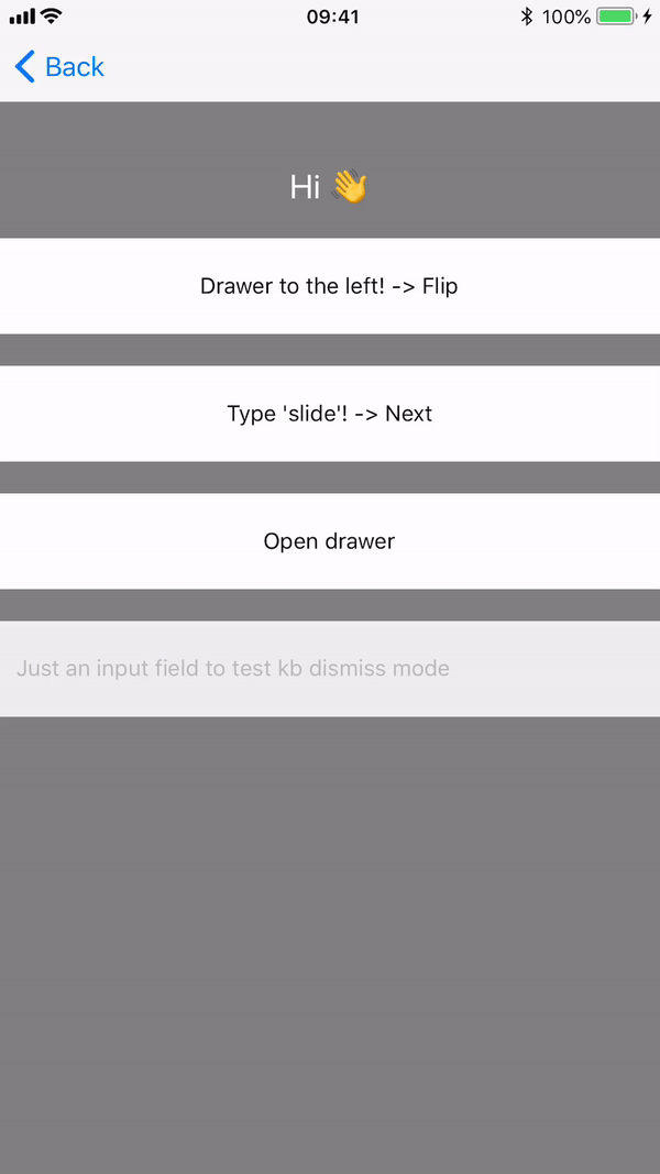
Type slide:
Type front:

Type back:

edgeWidth
number, allows for defining how far from the edge of the content view the gesture should activate.
hideStatusBar
boolean, when set to true Drawer component will use StatusBar API to hide the OS status bar whenever the drawer is pulled or when its in an "open" state.
statusBarAnimation
possible values are: slide, none or fade (defaults to slide). Can be used when hideStatusBar is set to true and will select the animation used for hiding/showing the status bar. See StatusBar documentation for more details.
overlayColor
color (default to "black") of a semi-transparent overlay to be displayed on top of the content view when drawer gets open. A solid color should be used as the opacity is added by the Drawer itself and the opacity of the overlay is animated (from 0% to 70%).
renderNavigationView
function. This attribute is present in the standard implementation already and is one of the required params. Gesture handler version of DrawerLayout make it possible for the function passed as renderNavigationView to take an Animated value as a parameter that indicates the progress of drawer opening/closing animation (progress value is 0 when closed and 1 when opened). This can be used by the drawer component to animated its children while the drawer is opening or closing.
onDrawerClose
function. This function is called when the drawer is closed.
onDrawerOpen
function. This function is called when the drawer is opened.
onDrawerSlide
function. This function is called as a drawer sliding open from touch events. The progress of the drawer opening/closing is passed back as 0 when closed and 1 when opened.
onDrawerStateChanged
function. This function is called when the status of the drawer changes. It takes two arguments:
newState: DrawerState- state of theDrawer. It can be one of the following:IdleDraggingSettling
drawerWillShow: boolean- iftrue,Draweris about to open.
enableTrackpadTwoFingerGesture (iOS only)
Enables two-finger gestures on supported devices, for example iPads with trackpads. If not enabled the gesture will require click + drag, with enableTrackpadTwoFingerGesture swiping with two fingers will also trigger the gesture.
children
component or function. Children is a component which is rendered by default and is wrapped by drawer. However, it could be also a render function which takes an Animated value as a parameter that indicates the progress of drawer opening/closing animation (progress value is 0 when closed and 1 when opened) is the same way like renderNavigationView prop.
mouseButton(value: MouseButton) (Web & Android only)
Allows users to choose which mouse button should handler respond to. The enum MouseButton consists of the following predefined fields:
LEFTRIGHTMIDDLEBUTTON_4BUTTON_5ALL
Arguments can be combined using | operator, e.g. mouseButton(MouseButton.LEFT | MouseButton.RIGHT). Default value is set to MouseButton.LEFT.
enableContextMenu(value: boolean) (Web only)
Specifies whether context menu should be enabled after clicking on underlying view with right mouse button. Default value is set to false.
Methods
openDrawer(options)
openDrawer can take an optional options parameter which is an object, enabling further customization of the open animation.
options has two optional properties:
velocity: number, the initial velocity of the object attached to the spring. Default 0 (object is at rest).
speed: number, controls speed of the animation. Default 12.
closeDrawer(options)
closeDrawer can take an optional options parameter which is an object, enabling further customization of the close animation.
options has two optional properties:
velocity: number, the initial velocity of the object attached to the spring. Default 0 (object is at rest).
speed: number, controls speed of the animation. Default 12.
Example:
See the drawer example from GestureHandler Example App or view it directly on your phone by visiting our expo demo.
class Drawerable extends Component {
  handleDrawerSlide = (status) => {
    // outputs a value between 0 and 1
    console.log(status);
  };

  renderDrawer = () => {
    return (
      <View>
        <Text>I am in the drawer!</Text>
      </View>
    );
  };

  render() {
    return (
      <View style={{ flex: 1 }}>
        <DrawerLayout
          drawerWidth={200}
          drawerPosition={DrawerLayout.positions.Right}
          drawerType="front"
          drawerBackgroundColor="#ddd"
          renderNavigationView={this.renderDrawer}
          onDrawerSlide={this.handleDrawerSlide}>
          <View>
            <Text>Hello, it's me</Text>
          </View>
        </DrawerLayout>
      </View>
    );
  }
}